Overview
At Gameloft I own features end to end, from onboarding and menus to core gameplay UI. Requests often arrive as one line from stakeholders, so my first job is turning them into a clear problem with agreed success metrics. Then every feature follows the same path: frame, explore, decide, design, measure. It keeps the team aligned and ties each decision to an outcome.The product is under NDA, so all examples on this page are illustrative.
Role
Senior Product Designer
Platforms
Mobile, TV and desktop
Ownership
Problem framing to final UI
Status
In development, under NDA
In depth
The methods and tools I chose for this project. They change with every project, depending on what the problem needs.
Framing the problem
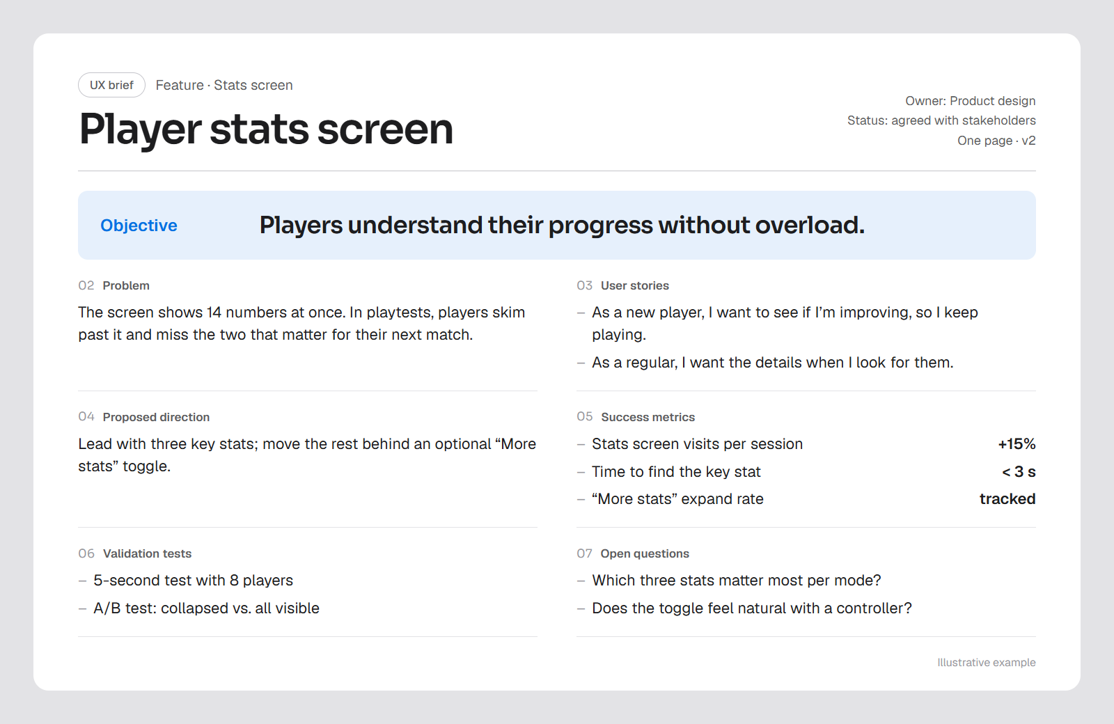
Every feature starts with a one-page brief:
- Objective
- Problem
- User stories
- Proposed direction
- Success metrics
- Validation tests
- Open questions
- Benchmarks
Agreeing on what success looks like before designing turns “make it better” into a target the whole team can work toward.
Exploring trade-offs
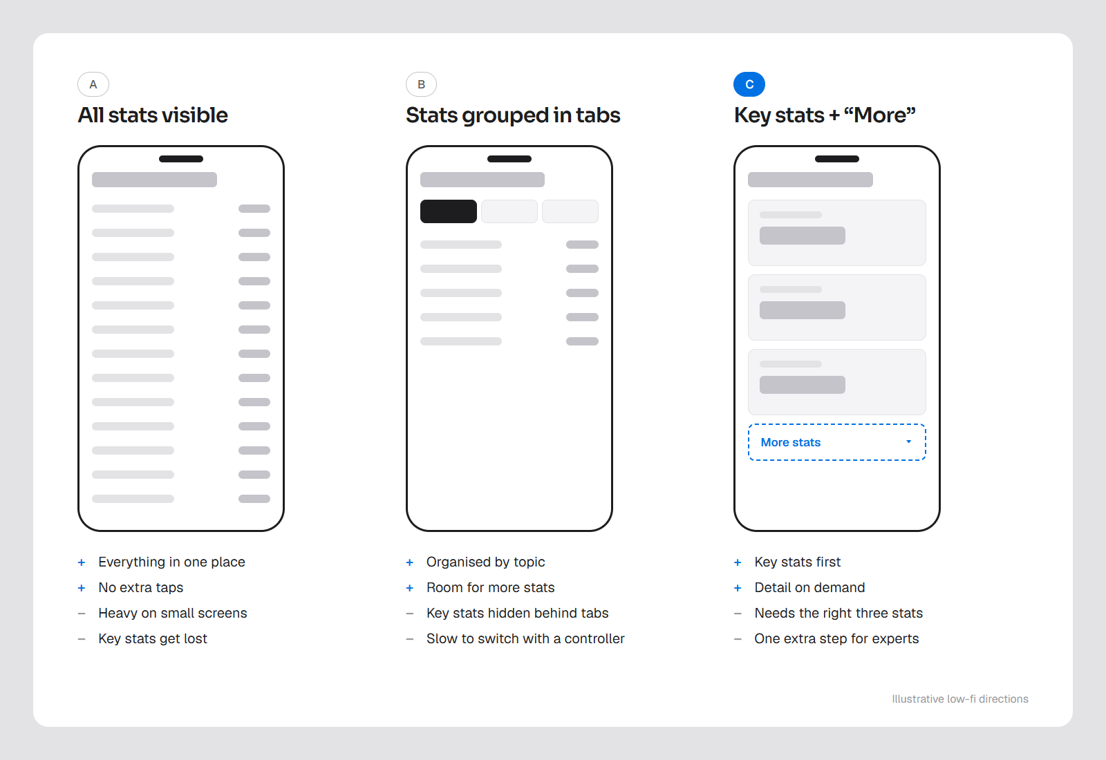
I explore two to four directions, each with pros and cons, a hierarchy map, the flow and key screens. Putting options side by side surfaces the real trade-offs early:
- Player value
- Complexity
- Engineering effort
- Scaling across touch, controller and keyboard
Deciding with the team
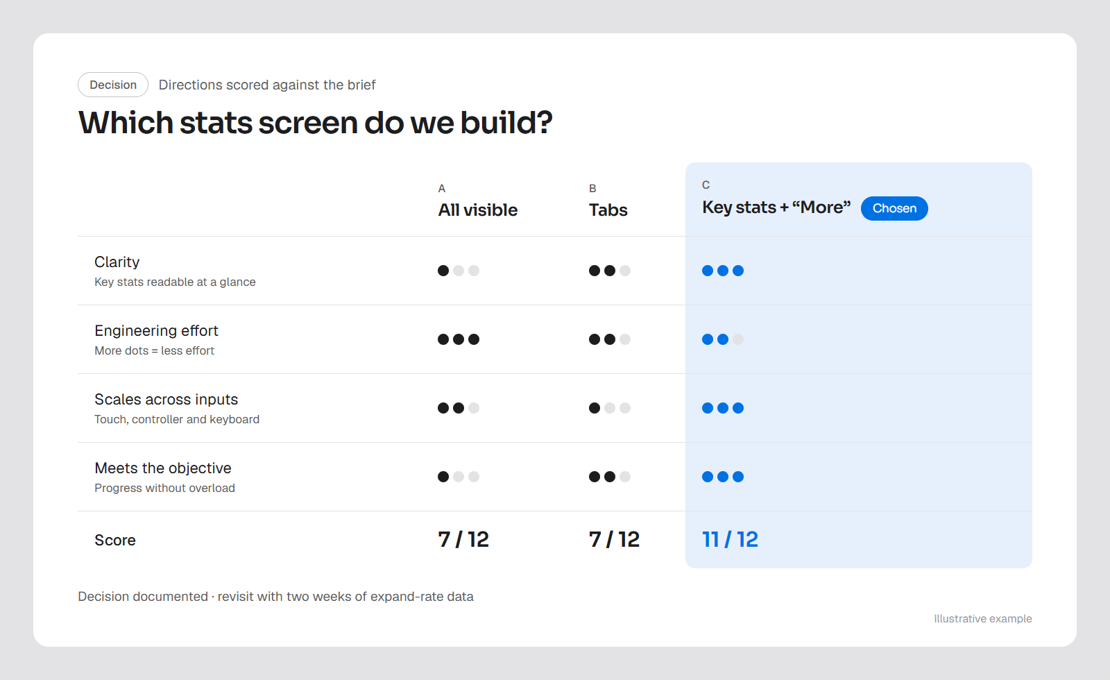
One or two directions go to full wireframed flows, with a table comparing what each one achieves against the brief's objectives.
Stakeholders decide on evidence instead of taste.
The decision is documented so it can be revisited when data comes in.
Designing the final UI
On the design system
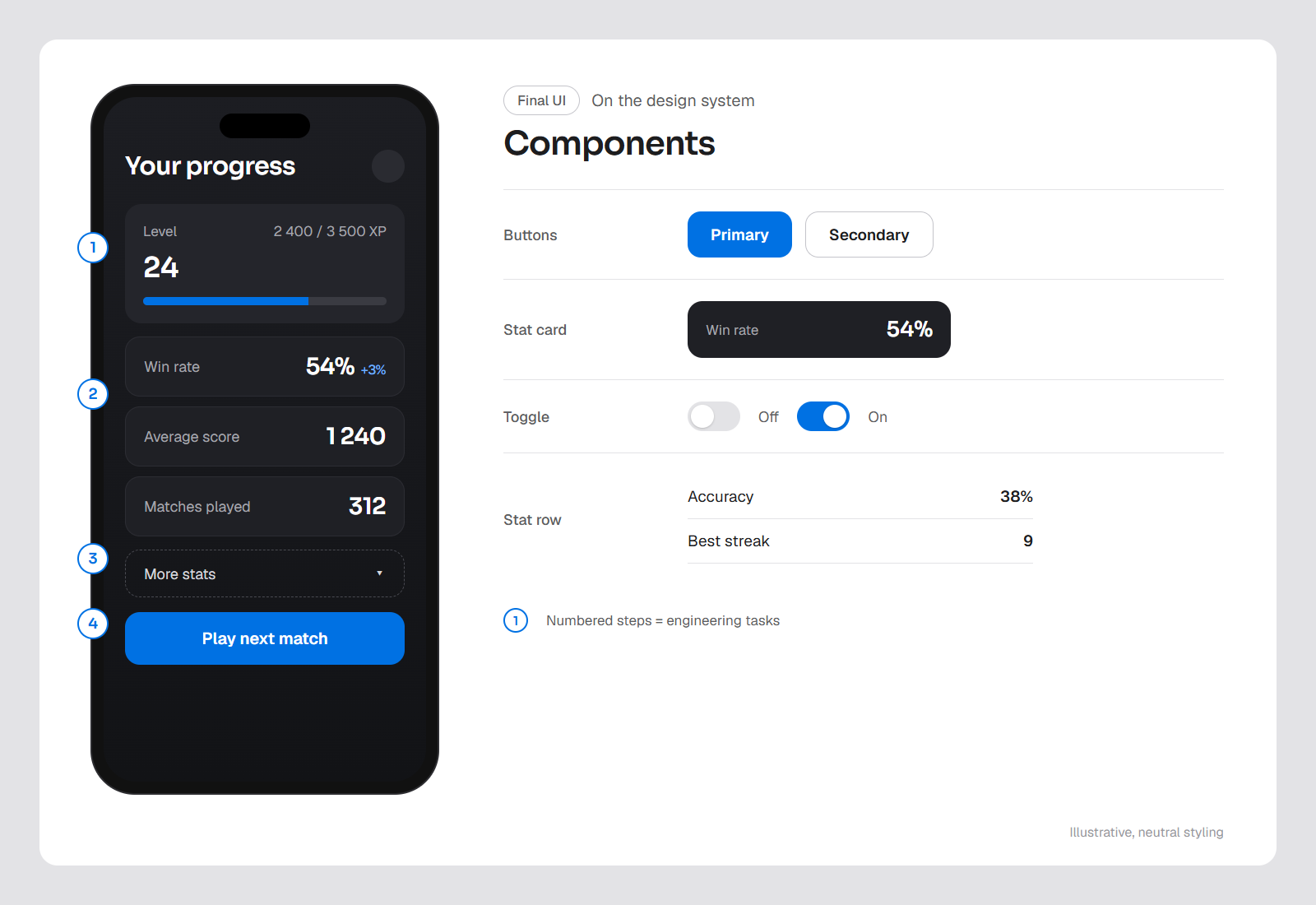
Final screens are built on a design system I’m growing from a wireframe kit into a full UI component library.
Ready for engineering
Flows are numbered so each step maps directly to an engineering task, which keeps the handoff clean and what ships faithful to the design.
Measuring what matters
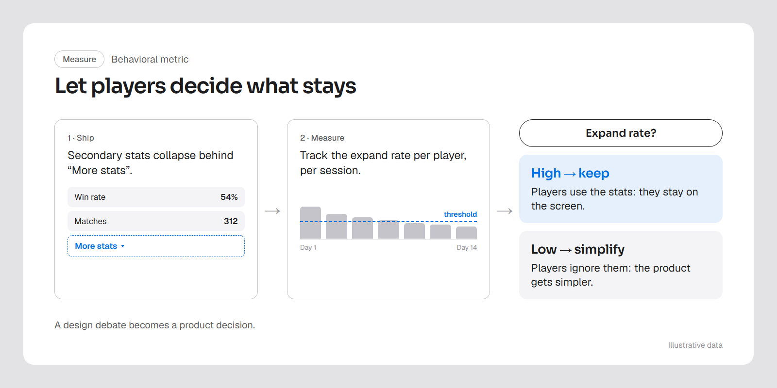
I start from research on learning and attention, then validate decisions in the product with behavioral metrics. For example, when stats risked overloading players, I proposed collapsing them behind a toggle and tracking how often players expand them:
- Players open them
- They stay
- Players ignore them
- The product gets simpler
Moving faster with AI
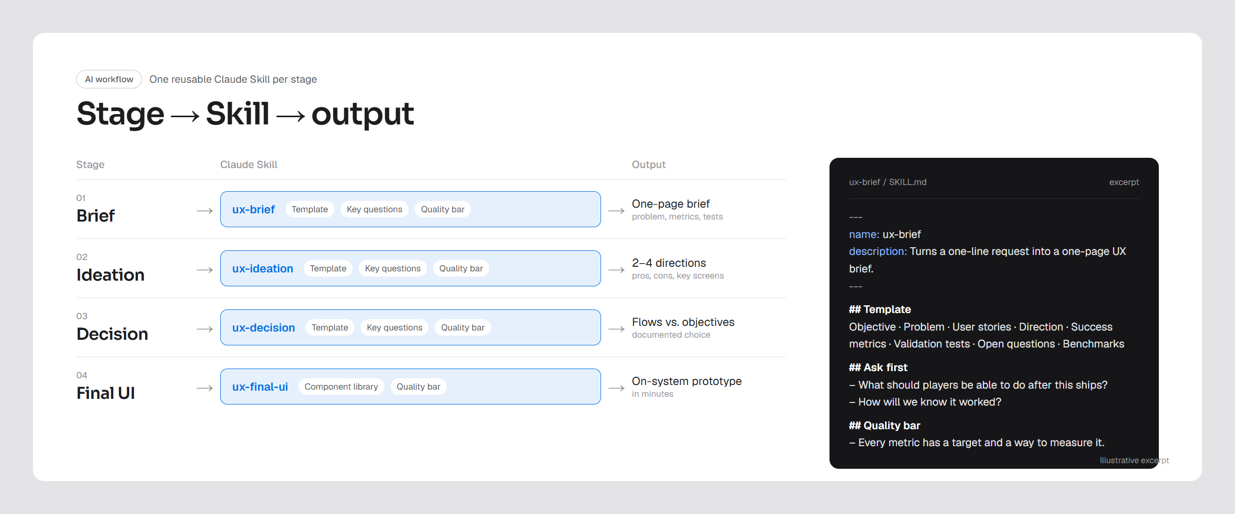
Each stage runs through a reusable Claude Skill that encodes the template, the key questions and the quality bar.
- BriefProblem and metrics
- Ideation2–4 directions
- DecisionFlows vs objectives
- Final UIOn the design system
Feeding the component library to Claude lets me generate on-system prototypes in minutes, so I can test more ideas without drifting from the design system.
Insights
Key takeaways from the project.
- The most valuable design work happens before the first screen: a well-framed problem saves more time than a fast designer.
- Writing success metrics into the brief changes the question from “do we like it?” to “will this move the number?”
- Simplicity can be tested. Instrumenting optional information turns a design debate into a product decision.
- AI is most useful when it encodes a method, not when it replaces one.