Overview
Got2Park connected drivers with unused private parking spots across Barcelona, a city where 500,000 vehicles enter every day for only 150,000 public spots. The idea was strong, but users were dropping out: they couldn't search, didn't understand the 15-minute booking window, and got stuck at doors that wouldn't open while the app kept charging. Working with two other product designers for the client, I took the product from research to a tested high-fidelity redesign of the full journey, from search to leaving the parking.
Role
Product designer, team of three
Client
Got2Park, Barcelona
Scope
Research to tested hi-fi prototype
Platform
Mobile app
In depth
The methods and tools I chose for this project. They change with every project, depending on what the problem needs.
Finding where users get stuck
- Usability tests
- Six target users: sales reps and young drivers
- Content audit
- 52 screens
- Benchmark
- Four direct competitors, plus indirect ones like Cabify and Yego
Four problems came up again and again:
- No search
- A stressful 15-minute countdown
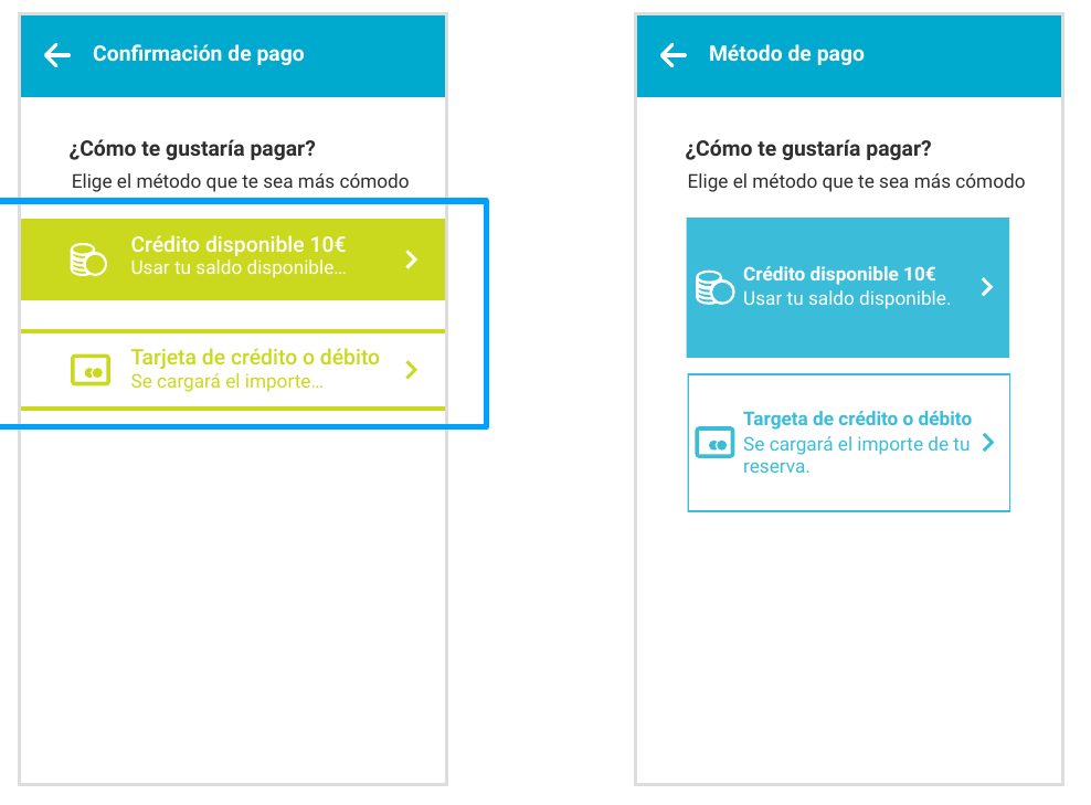
- Unclear payment options
- Digital keys nobody understood
Testing the real service
We booked and used a real Got2Park spot ourselves. It took almost 20 minutes, because of:
- An unclear entrance
- Directions based on identical columns
- A spot number we missed
- A door that failed nine times while the meter kept running
We then rebuilt the journey as a desktop walkthrough with paper and post-its to map every touchpoint, online and offline.
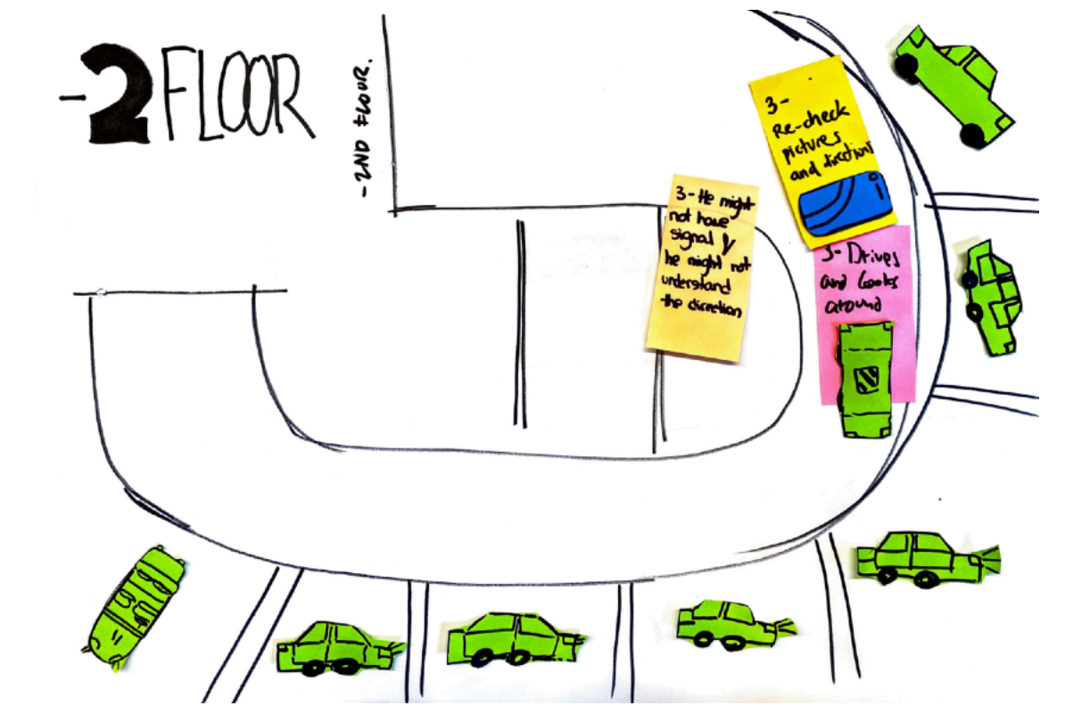
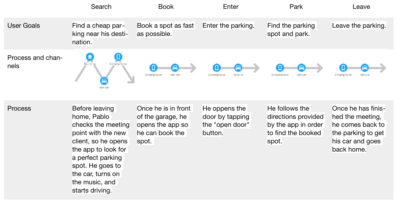
Mapping the journey
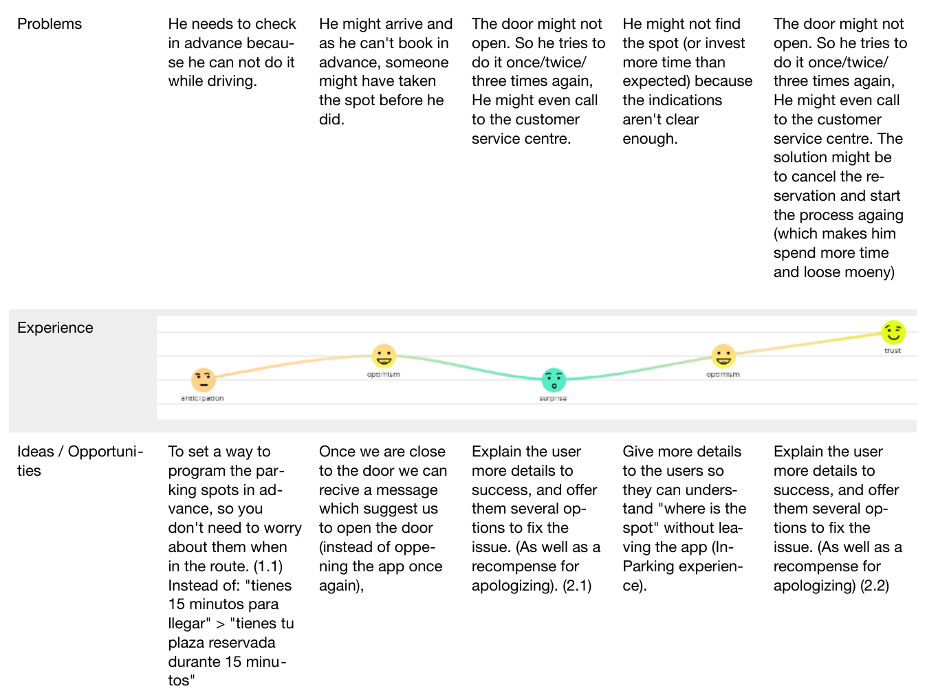
The journey map split the service into five moments, with goals, problems, emotions and opportunities for each.
- SearchFind a spot
- BookHold it
- EnterGet in
- ParkFind the spot
- LeaveGet out and pay
It led to one problem statement:
Got2Park needs a way to guide parking seekers so that they succeed in finding a parking spot.
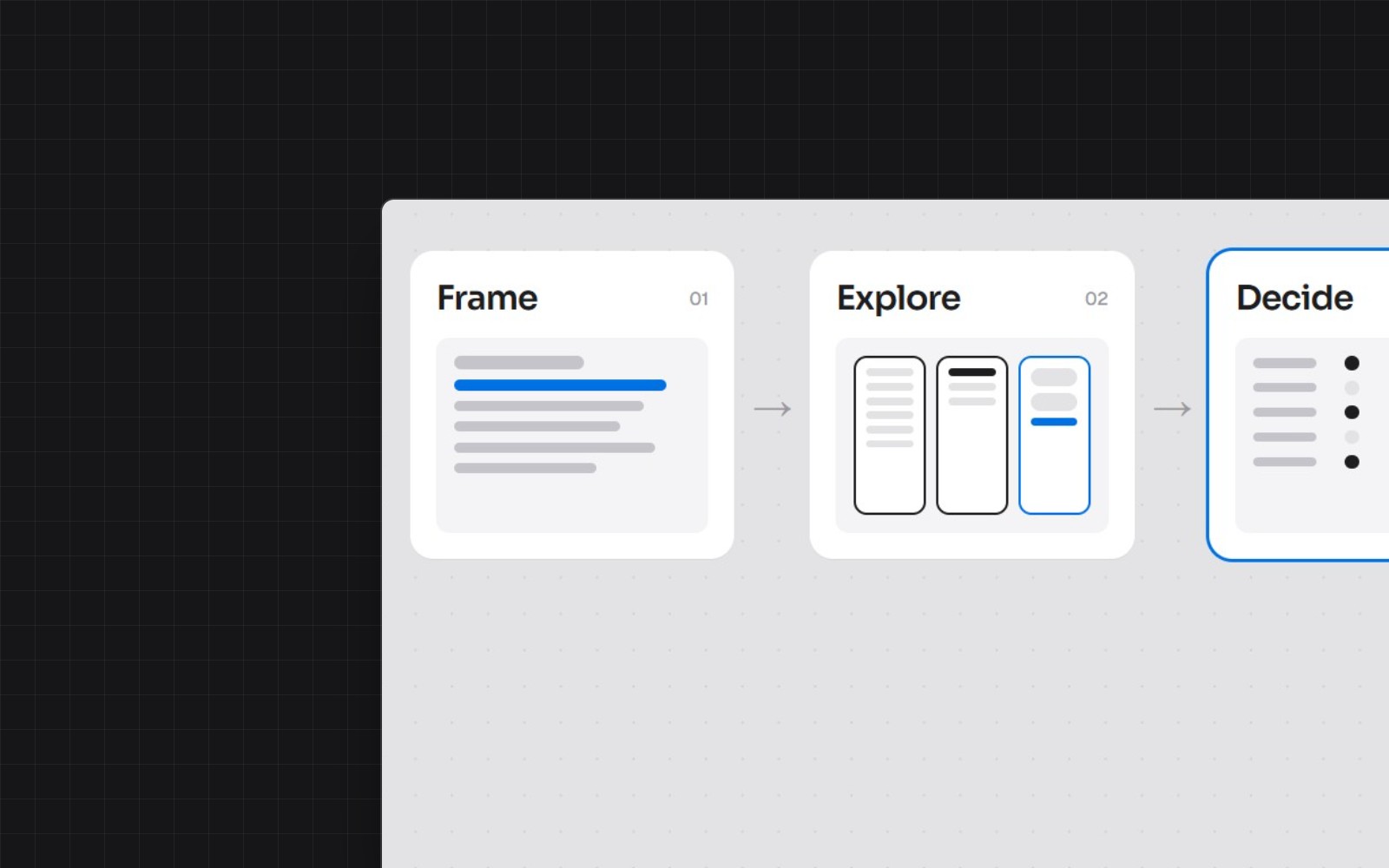
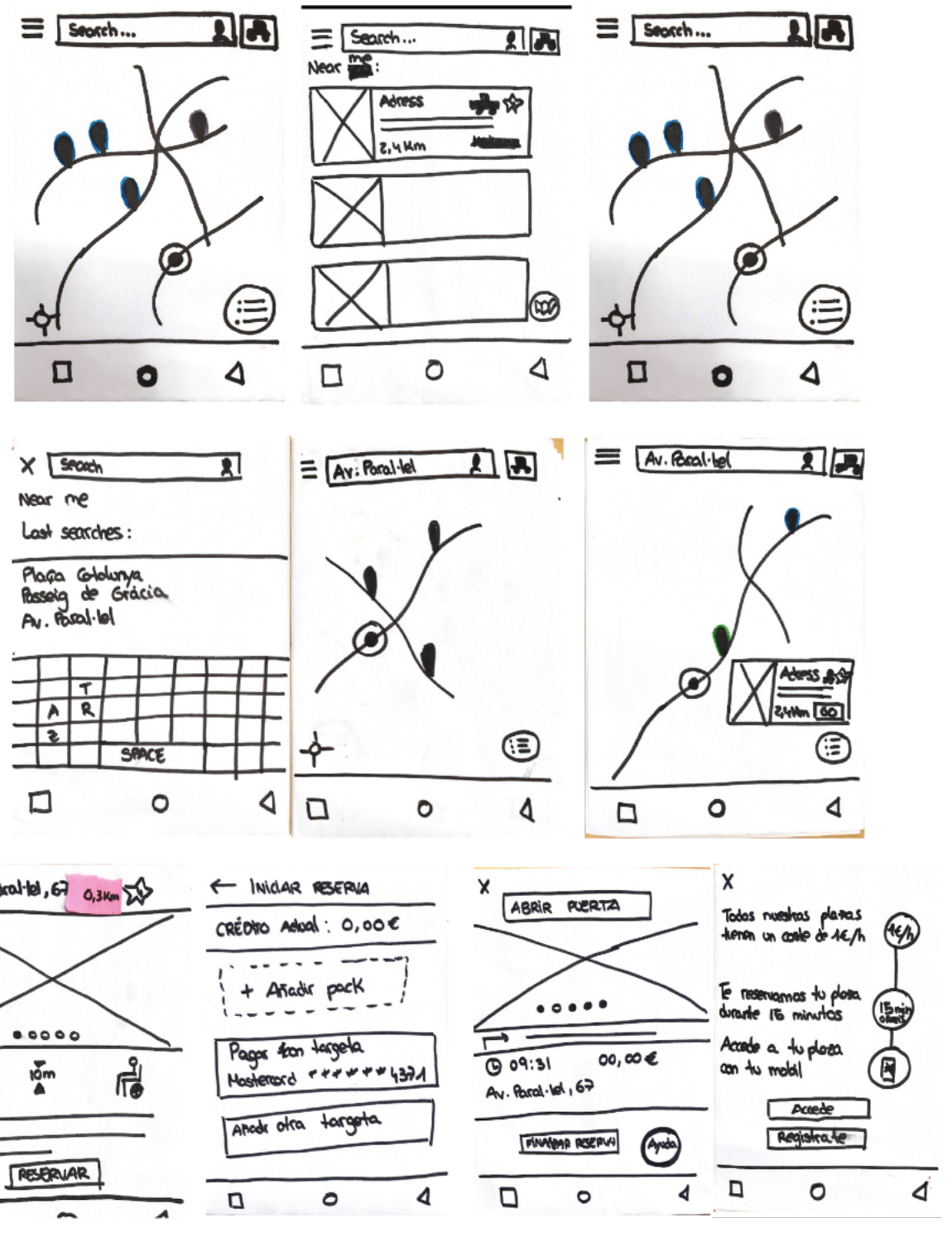
Prototyping and testing
- Crazy 8s
- Paper prototype · tested with 8 people
- Mid-fidelity · tested with 10
- High fidelity
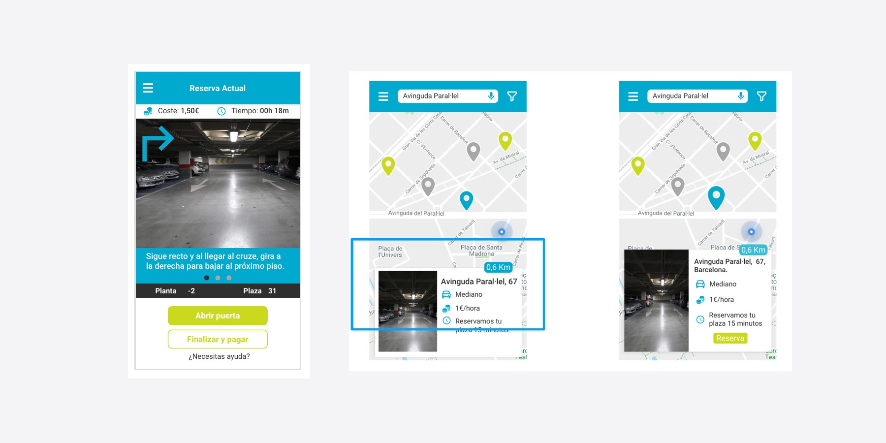
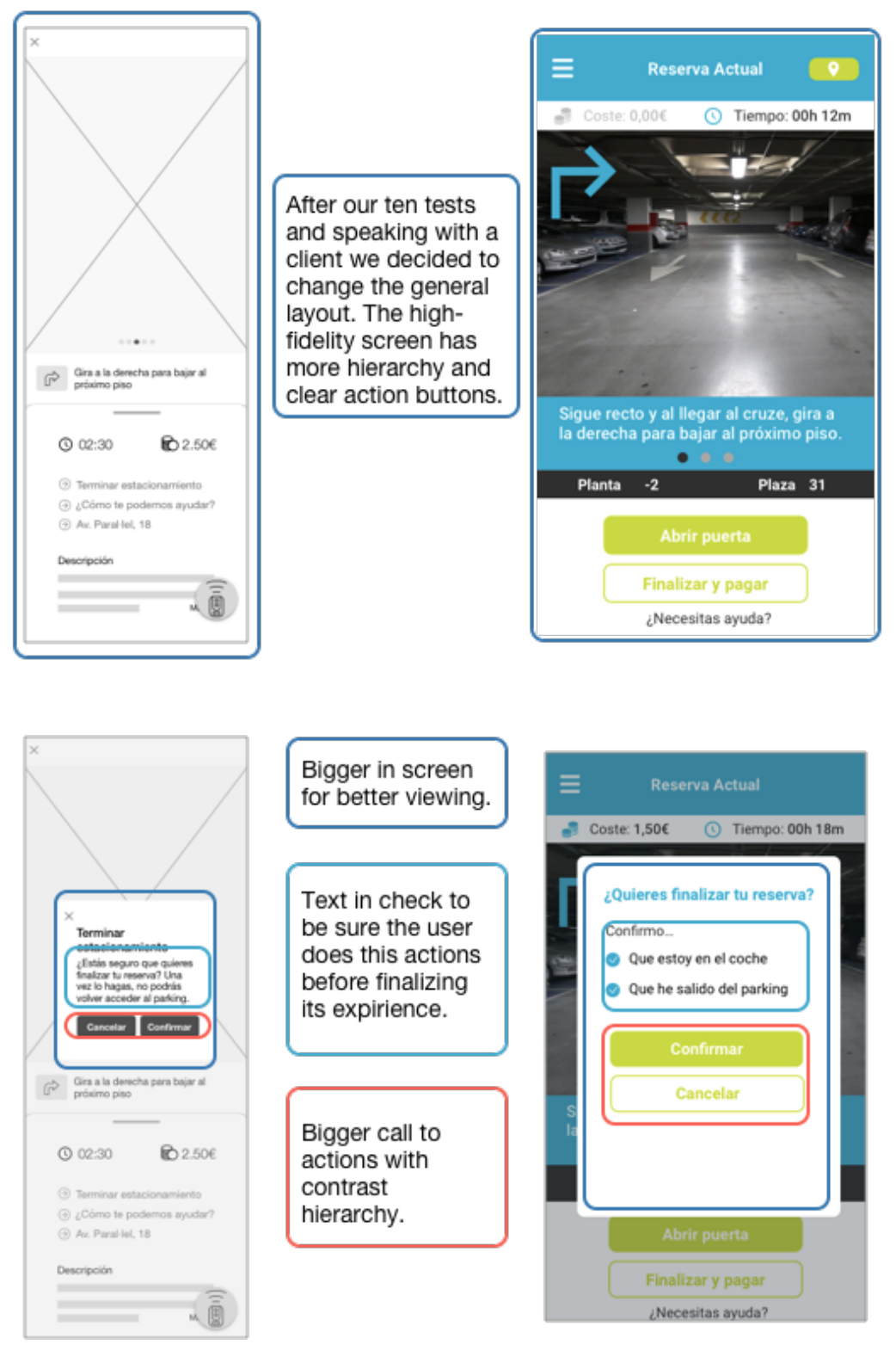
We iterated after each round: a clearer action hierarchy, payment moved to the end of the journey like ride-hailing apps, and a confirmation step to make sure users had left the parking before finishing.
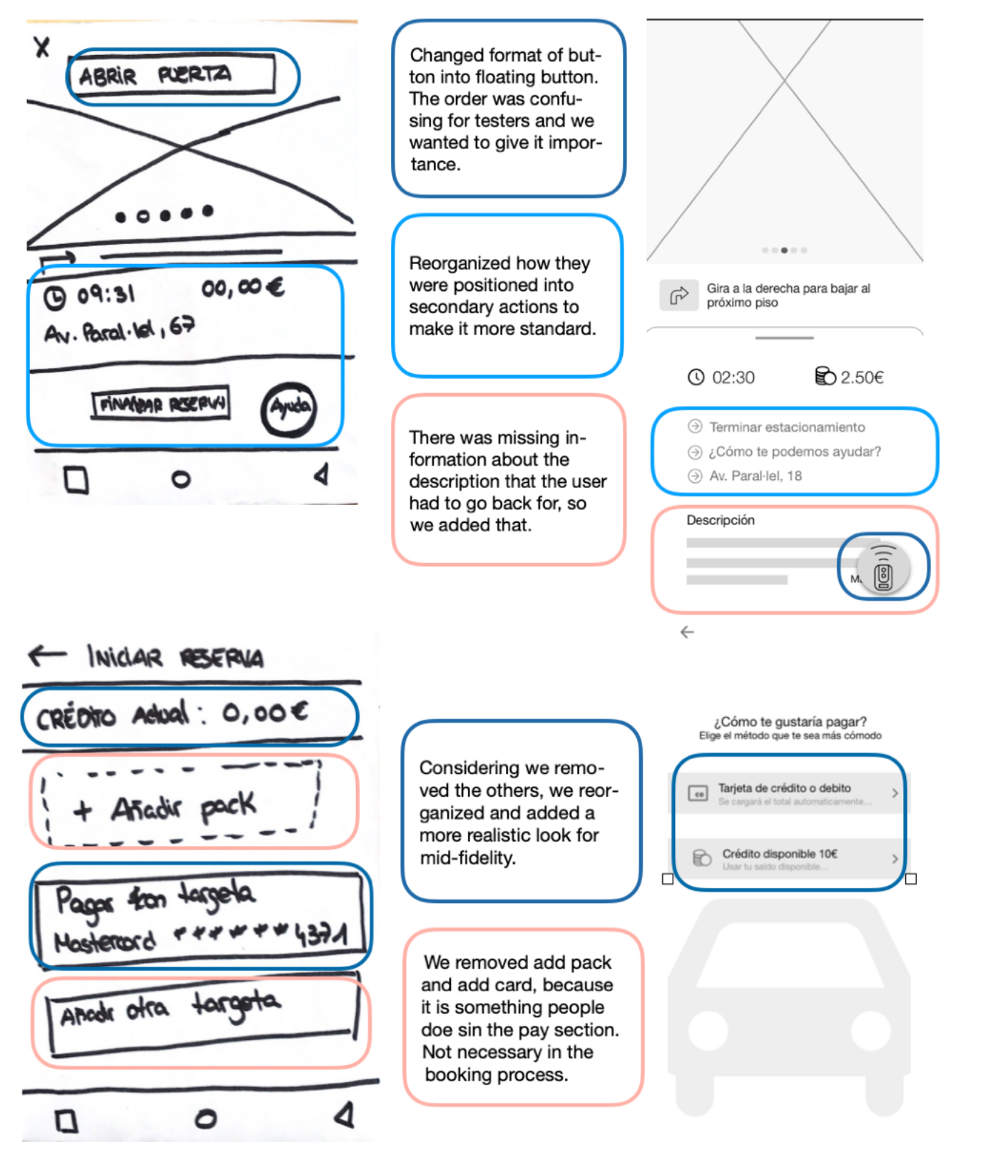
Designing for failure
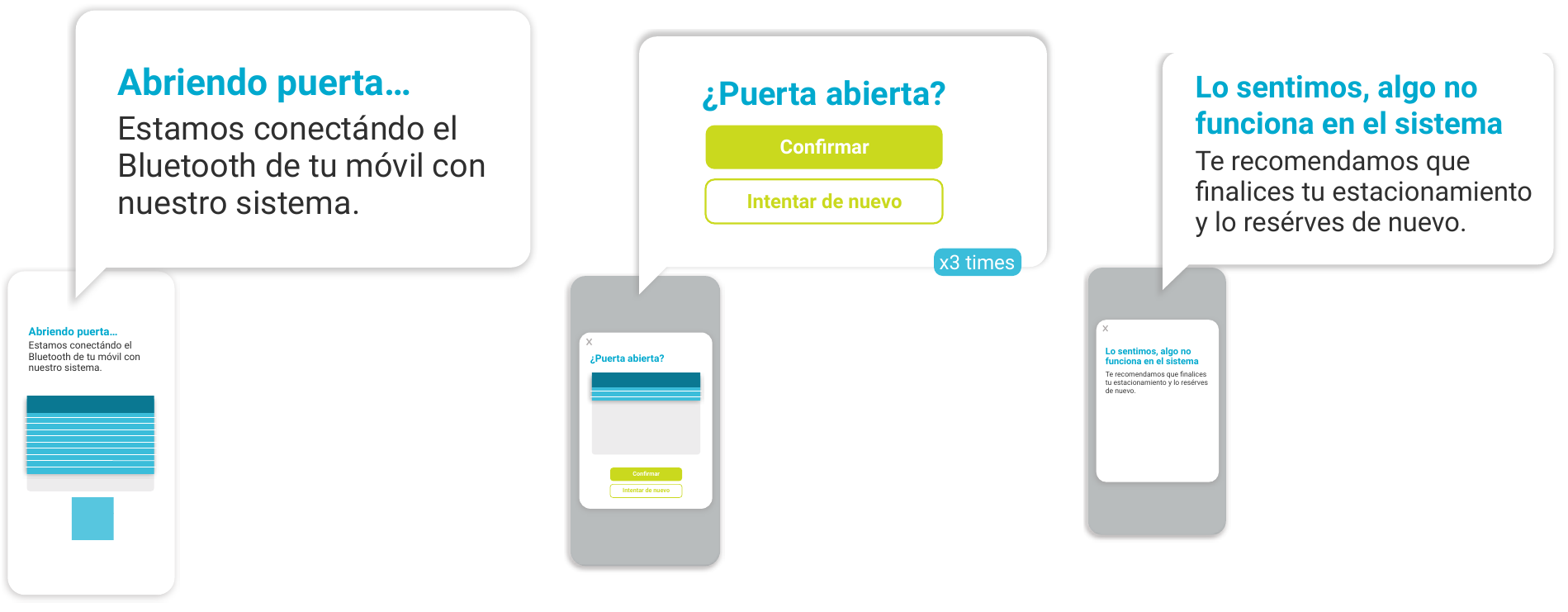
The door technology was still in beta, so instead of hiding failures we designed for them:
- 1 · ConnectingA message while the phone connects to the door.
- 2 · “Door open?”A check with retry, up to three times.
- 3 · Still failingA clear next step, so nobody is left stuck.
Users always knew what was happening and what to do next.
The final experience
What changed
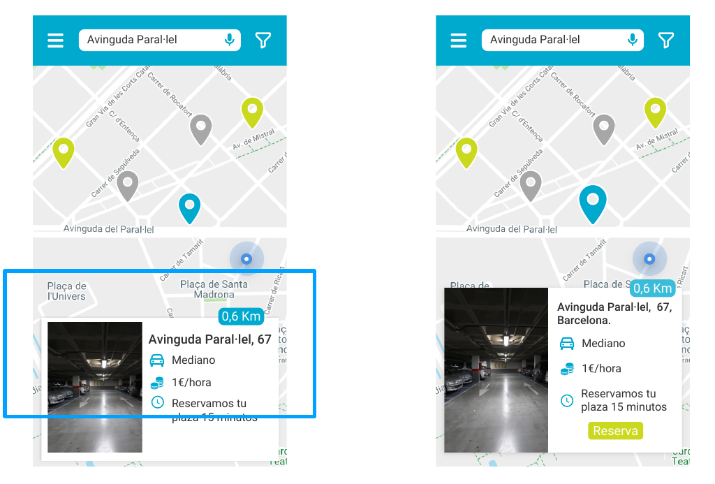
- Search and a quick-book shortcut for repeat drivers
- The 15 minutes reframed as “we hold your spot” instead of a countdown
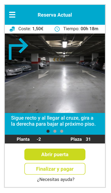
- Guidance inside the parking: floor, spot and turn-by-turn directions
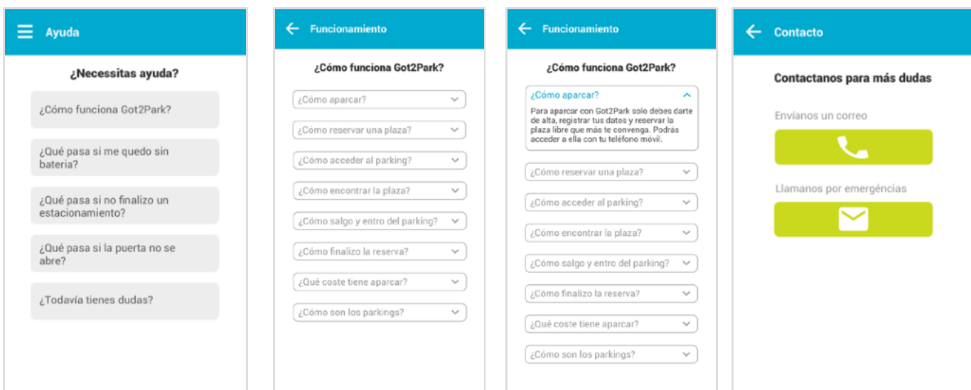
- Clear payment options
Insights
Key takeaways from the project.
- The biggest problems weren't on screen. Testing the real service exposed issues no usability test would have found.
- Designing for failure builds trust. When technology is unreliable, clear messages matter more than a perfect happy path.
- Words change behavior: the same 15 minutes felt like pressure as a countdown and like a benefit as a reservation.
- What I'd do today: define success metrics upfront (booking completion, support calls about doors) to measure the redesign's impact after launch.